VanMoof
Making a valuable my account experience
VanMoof is a dutch startup—now with a presence in the US, Asia, and Europe—making next-gen electric bicycles that are sleek, fun, easy, and city-proof with anti-theft functionality built in.

MY ROLE & SKILLS
UX Analysis & Research
UX Design
User Research
User testing/interviews
Personas
User Journey Map
Ideation & Validation
Prototyping
User Flows / Screen Flows
Interaction Design
Information Architecture
Wireframes
UI Design
Design System
PLATFORMS
PLATFORMS
Mobile (iOS & Andriod)
Responsive Web
Web, Mobile App (iOS & Android)
TIME PERIOD
TIME PERIOD
September 2020 - Current
September 2020 - Current
Challenge
VanMoof’s customer portal, while relevant, was suffering from inefficiency ranging from inability to provide correct/up-to-date information to the customer awaiting their orders to supply adequate information and support. To combat, I was tasked with re-designing their customer portal in a way that provides them with clear benefits and value to a customer.
OUTCOME
I have successfully defined the current problems the end-users go through, re-establish the values to them in their customer portal, and build a consistent experience in consideration with the VanMoof app.
IMPACT
Instead of a simple re-skin, VanMoof, through this opportunity, was able to examine why and how behind the dissatisfaction coming from the users. With the clear values re-established, both VanMoof customers and the business are satisfied with how we are moving forward.
Personally, I was excited to be a part of this particular journey to be able to strengthen VanMoof’s User Experience Design process, bringing the users’ voice in to give proper validation into all the hard work we were doing.
We were tasked with re-designing and re-inventing the online banking platform on both web and mobile. We worked on achieving this goal per feature. After carefully reviewing the requirements, we were able to re-build the entire bank’s online channels from scratch in a way that meets users’ needs. The end product’s goal is to help digitize the every day banking activities in a simplified but secured process.
How we started: problem validation
Persona definition - who are our users?
To kick this project off the ground, the first question I asked was who our users are. Together with the team, we began questioning a-z about the situation, even asking ourselves if having a my account page was even valuable, or we have one just because everyone has one. We identified that the Web my account portal was necessary distinction to divide pre- and post-bike experience for the users since the customers move onto using the app after they receive the bike. We have chosen the two personas below to represent just how diverse the user base is, who are using our my account area.
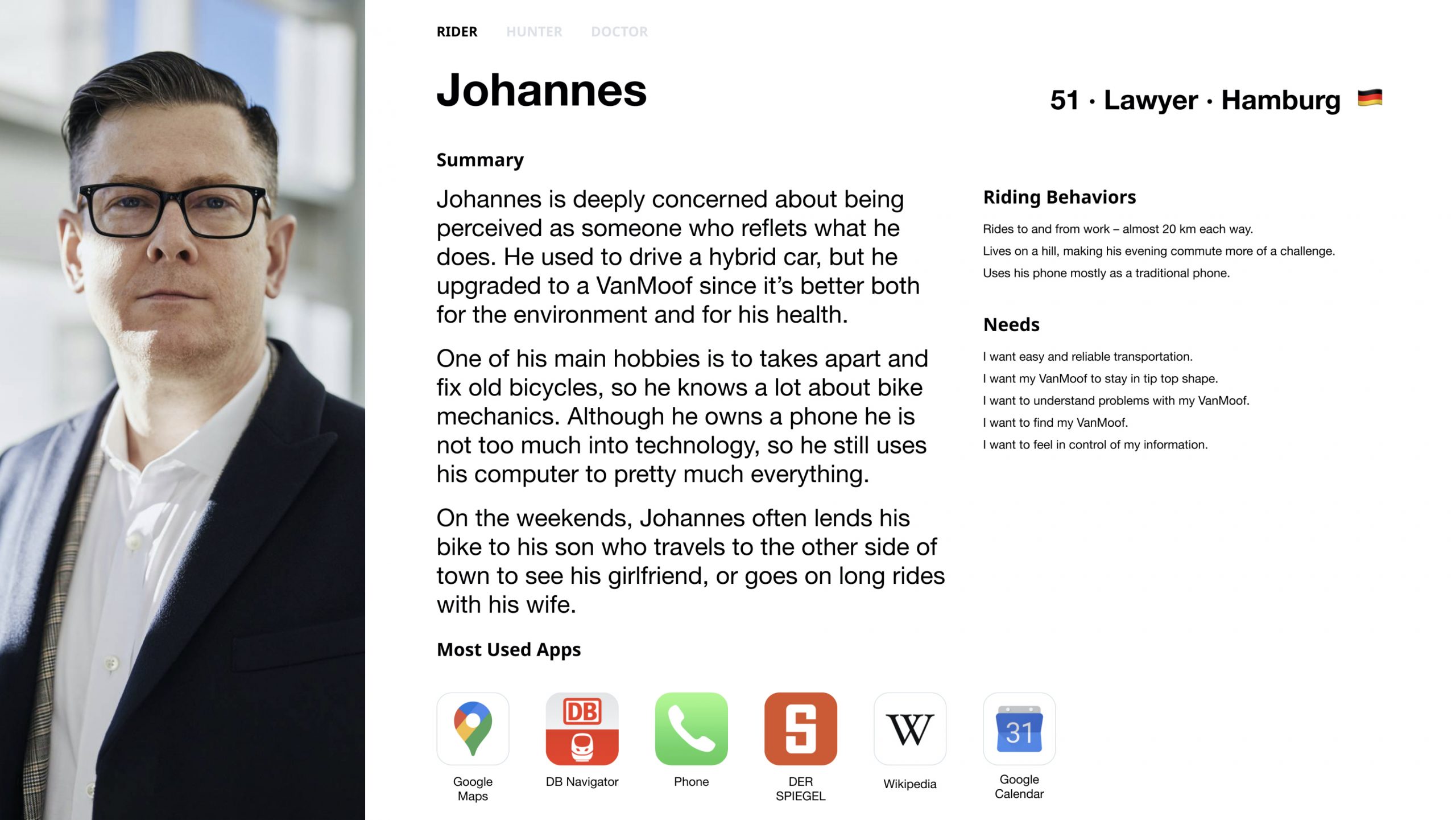
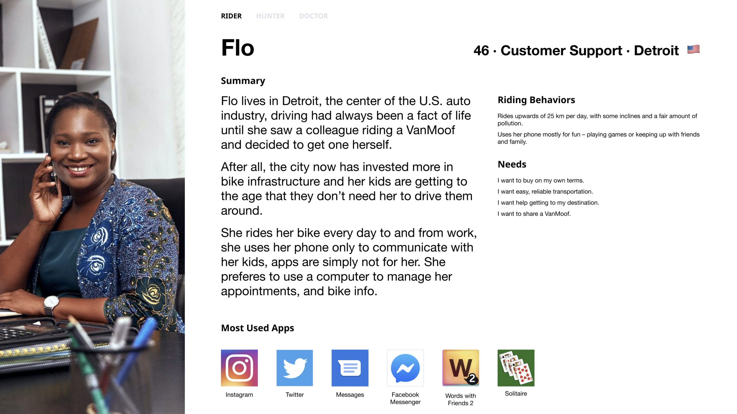
The two very diverse persona we identified with using our my account area.
Interviews - gather what we know
With the evidence that our users are inherently unhappy with how our my account experience is set up, I decided to interview our customer help desk employees, who are the first contact point for the users to share their complaints with. This process was extremely valuable for all of us involved with this project to know the biggest pain points were.
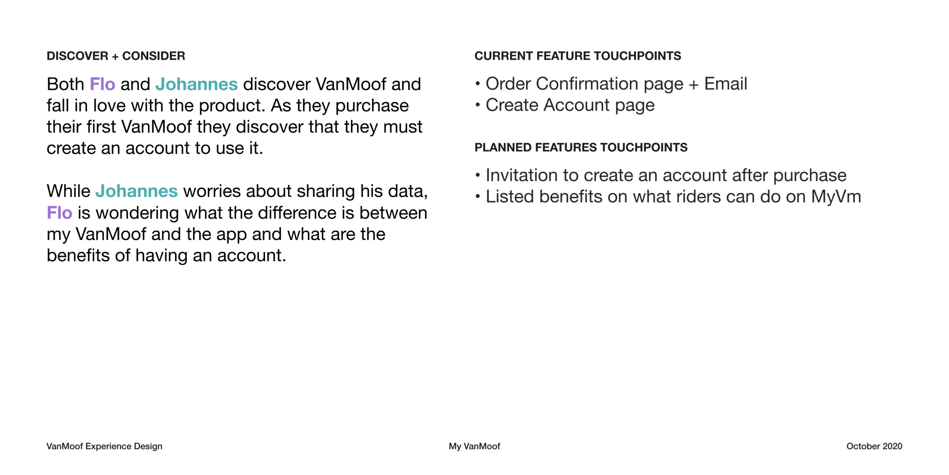
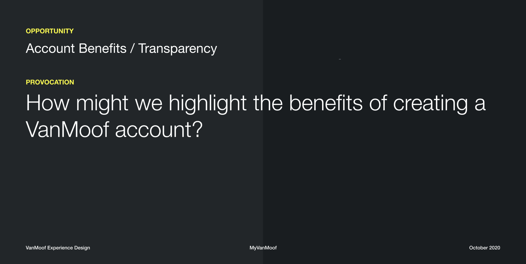
User Journey Map - what are they going through?
After, I started plotting and assembling the user journey map to understand what the current users are going through, ensuring to plot their pain points that we know. Eventually, it was assembled with the two personas represented with their emotions, actions, thoughts, and touchpoints to VanMoof with each phase. I have distinguished the current existing touchpoints vs what we planned to have in the near future, and lastly the opportunities that come up after all was considered.
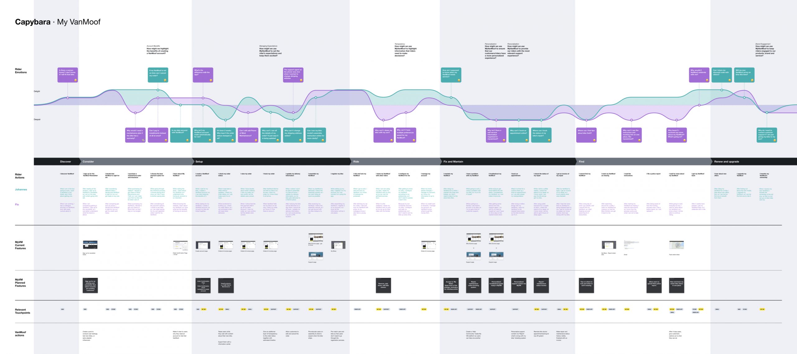
The complete user journey map. This was later used as a basis of the ideation workshop.
Ideation: what can we do to help them?
Ideation workshop
After the journey and the pain points of our base users were clearly identified, together with everyone involved in the project, I decided to hold an ideation workshop to gather voices from everyone on how might we help the users with their pain points. Each pain point in the journey map was translated to the actions each personas take, and into a How Might We sentence to provoke the ideation process.

A few example slides from the ideation workshop presentation.

The ideation workshop done in Miro with the team members. It was later on narrowed down via voting.
Exploration: ways to capture a clear value
Coming up with different Information Architecture + Interaction models
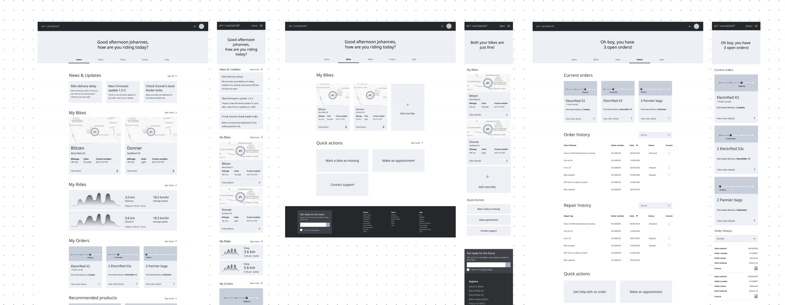
With the diverse ideations set in place, we were able to extract the capabilities and features for the new my account area. On basis of that, we were able to come up with different ways to bring values to the users by disecting and coming up with different IA and Interaction models with using mid-high fidelity wireframes. This synthesis was presented back to the project team to decide which direction we were moving forward with.

Three different direction approaches we came up with. Each direction comes with clear benefits and unique interactions. The team chose to move forward with the ‘All Mine’ view, to be even more aligned with the experience on the app.
Conceptualize & Test: Do our ideas solve the problems?
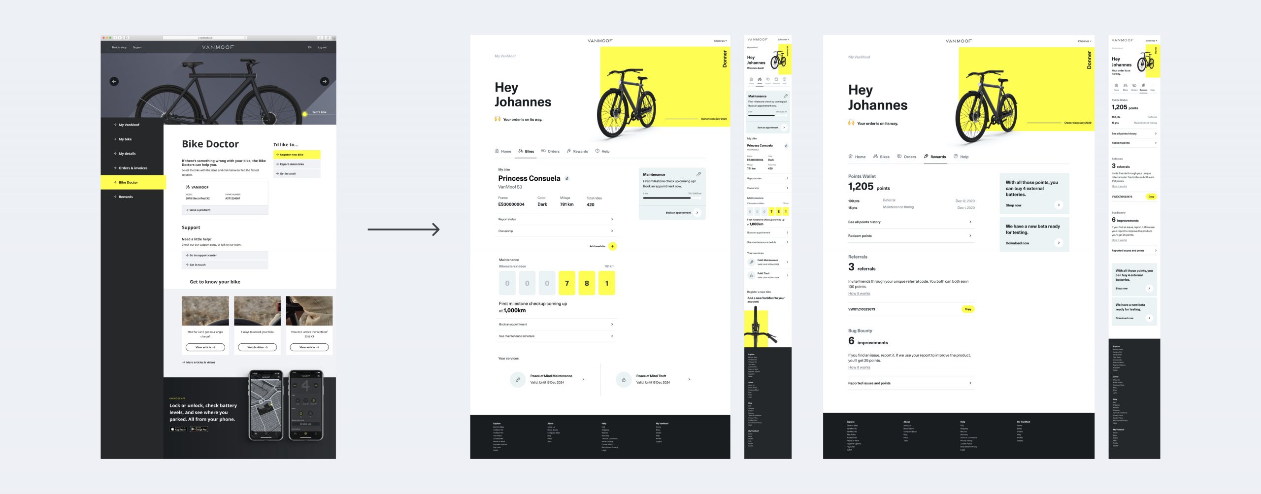
Detailed wireframes & prototyping
With the direction chosen, I took time to detail the wireframes, ensuring that all the ideas and features we came up with were properly included in places. Then, I prototyped it on Figma, and took it to the sample pool of our customer support team members to test out the ideas and see if it would resonate with our users. The prototype could be explored using a Figma link here.
Sample screens of the detailed wireframes
User Testing: Do our ideas solve their problems?
After the prorotype was completed. I decided to take some time out to do an informal user testing against our customer support team members, among which are members who’ve been hearing the same complaints for years. This step was a vital in the project due to the amount of insights we gathered on the ideas we generated, and with those I was able to fine-tune the solutions to ensure our new platform addresses the users’ problems appropriately.


The user testing log with detailed report on what, how and recommendations
Conclusion
UI Design & Continuation
All this, then turned into a re-design of the current platform. While maintaining the current features, we also carefully directed the new features to be inserted into each page. Currently, in the design team, we are busy with crafting and updating the design system with the new elements and components, and at the same time it’s being developed with the team, running in 2 week scrum/agile cycle. As the main designer in this process, I am responsible of delivering the finished designs ahead of time, running the designs through the PO and the development team to garner feedback and ensuring the smooth hand-over.
Design Sprint - day to day
Kick off workshop: Comprehensive home
As a design team, we also carry out what we call the ‘Design sprints’ with 2 week cycle. Each Design sprint carries a specific goal/theme in mind that’s either related to an upcoming release, design debt, or an OKR set by the team. Each design sprint gets kicked off with a workshop with the design team, and the stakeholders, keeping in mind the customer journey map we stick by.
Below is one of the design sprints we recently went through - with the theme “Comprehensive home”, where we were brainstorming ideas on how to make sure the landing page and the app home page delivers value.


The kickoff workshop we ran with the team and a few engineers to brainstorm what we can do on the home page of both web & app.
Concepts - initial designs
After the workshop, we are left with defined concepts that we take to explore with the initial set of designs on to our platform to see how they can be utilized in different ways.
Design critique - gathering mid-feedback
At a 1 week cycle, we circle back with the Product Owners and the Development team to ensure that we are on the same page, heading to the right directions and gather their critiques on the ideas and the designs, which all coming together ensures the smoothest handoff at the end of the sprint.

The snapshot of the raw figma board we used to draw out the concepts.
Detailing and solidifying the ideas
After the mid check in point, we move on to detailing the designs and the ideas with detailed screens, building prototypes if necessary. For the comprehensive home, as an example, we thought to have a pollution level checking functionality on their surroundings on the VanMoof app, when the users are ready to ride their bike. In order to bring the right impact, we have prototyped it to communicate the idea correctly.

The pollution level checker prototype on how it works
Design review - final handoff
At the two week point, we conduct a final design review with appropriate presentation materials with thorough explanations on what each idea and screens mean in relation with the customer journey. With the complete set of designs shared with the team, they get fed into the existing sprints that the developers are carrying out, and as a team I assist with breaking the designs down to appropriate sprint size, and continue to assist them day to day with any questions or modifications needed.


Snippet of the presentation deck to present to the wider audience + Final design handover board on Figma
Conclusion
VanMoof is a fast moving organization with big ambitions to make an impact in the world. I’m beyond excited to be a part of the team to help them open their eyes on building the right solutions with the users’ voice infused.


Robin Sieun Bae © 2024