HomeMe by Rabobank Innovation Hub
Creating a market solution for the first time home buyers
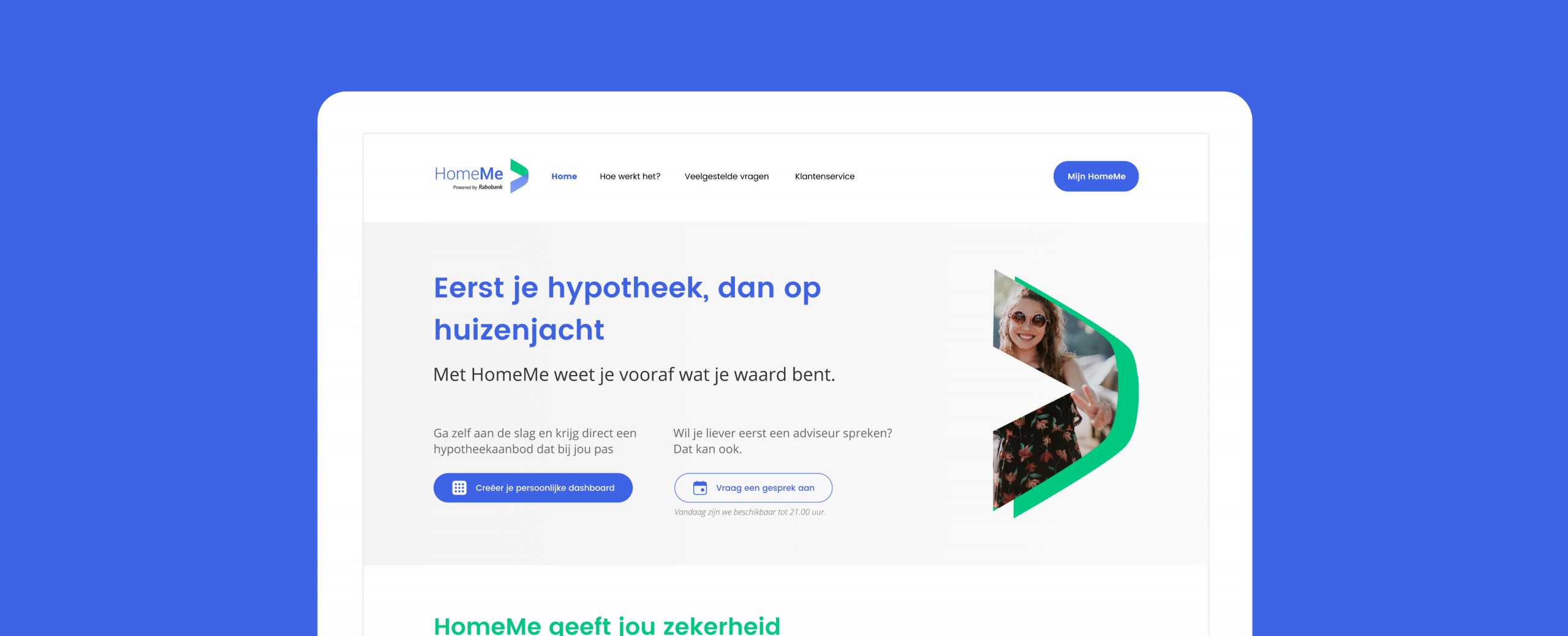
Rabobank Innovation Hub and Mobiquity are partners in creating and realizing new market solutions. HomeMe is one of the products that I helped bring to life while working for Mobiquity: a modern solution to finding your home with peace of mind.
Rabobank Innovation Hub and Mobiquity are partners in creating and realizing new market solutions. HomeMe is one of the products that I helped bring to life while working for Mobiquity: a modern solution to finding your home with peace of mind.
MY ROLE & SKILLS
UX Analysis & Research
UX Design
User Interviews
Usability Tests
Persona
User Journey
Ideation & Validation
Prototyping
User Flows / Screen Flows
Wireframes
UI Design
PLATFORMS
Web
Web, Mobile App (iOS & Android)
TIME PERIOD
TIME PERIOD
April 2020 - August 2020 at Mobiquity
Challenge
The Rabobank Innovation Hub is a branch inside the Rabobank that acts as an independent investor to any Rabobank employee that comes up with an idea that can solve a problem that exists in current market. Mobiquity is partnered up with the Innovation Hub to help the ideas turn into a full grown company and a product. HomeMe is an idea that was raised to help simplify the complex process that comes with buying a home, and at the same time helps giving people complete transparency, confidence and an ability to determine their own financial decisions and mortgage options.
OUTCOME
We have turned an idea to an existing product, ready to be launched in the market.
IMPACT
After each week of rigorous testing, most risky assumptions on all three dimentions (Desirability, Feasibility, Viability) were validated with sufficient data to support it. More than 70% of the participants have said that they would use HomeMe to close their mortage. Hence, HomeMe will move onto the next phase that is builidng the MVP and continue to follow up with more repetitive and accurate testings on the assumptions.
Personally, I had a lot of joy watching a product I’m designing evolve so much and drastically as we conducted experiments to validate our assumptions. I learned tremendously about the value of continuously listening to the end users once again.
We were tasked with re-designing and re-inventing the online banking platform on both web and mobile. We worked on achieving this goal per feature. After carefully reviewing the requirements, we were able to re-build the entire bank’s online channels from scratch in a way that meets users’ needs. The end product’s goal is to help digitize the every day banking activities in a simplified but secured process.
Approach
The HomeMe project was set up according to Mobiquity’s own way of working ‘Digital Traction Model’, developed specifically for Rabobank Innovation Hub, building an idea to a fully working product at the end. Each phase lasts about 8 weeks, with an intensive weekly testing & improvement cycle. I was inserted to the project at the Problem Fit to Solution Fit, help shaping the product by validating ideas and solutions to ensure we can develop and build the right product.

Mobiquity’s own way of working: The Digital Traction Model. In the ‘Gear 3, Solution Fit phase’ is where I helped for HomeMe.
Where the project started
Ignition/Problem Fit phase: Market research & preperation
HomeMe team, with one product designer, a UX researcher, a stakeholder, and a project manager kicked off the project with the vast data Rabobank already possessed on the idea, which was based on the market gap they saw. They used various methods to shape the idea, including a lean business model canvas, data analysis, drawing up a persona and user journey map.

The lean canvas, value mapping exercises, persona and journey map that the team has done as background work for the project kickoff.
How I began
Solution Fit phase - validating desirability, viability, and feasibility
When I was inserted to the project was when the team kicked off to the Solution Fit phase for 8 weeks - aim to validate viability and feasiblity of the ideas and solutions we thought of. With 2 product designers in the team now, we had enough brain power and capability to put the ideas onto screens. I started designing MVPs based on the findings gathered so far.
Setting up assumptions and hypothesis
Before we began sketching out the solutions, we in the team took time to agreed upon the biggest pain points that were discovered in the Problem Fit phase, the potential solutions, and the assumptions on each dimensions (desirability, viability, and feasibility) accordingly. Afterwards, we agreed on the KPI’s to verify our success at the end.
Planning timelines and experiments
Since the project was planned to last 8 weeks, it was crucial for us to be aligned on what our activities, aims and goals were before the project began. Based on the assumptions and solutions we drew up a detailed planning for our activities and experiments for the rest of the project.
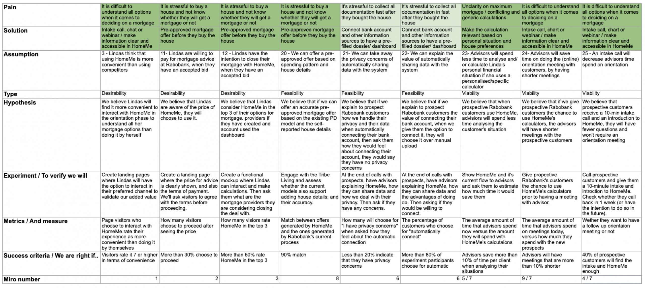
The list of assumptions/hypothesis we wrote down and kept track of throughout the project


Detailed plannings for our timeline and activies for the 8 weeks
Weekly testings and evolution of the screens
According to our rigorous testing plans, we picked out the assumptions to be tested at the beginning of each week, design/prototype the screens and test it at the end of the week. After synthesizing the testing results we agreed on the changes to the product.
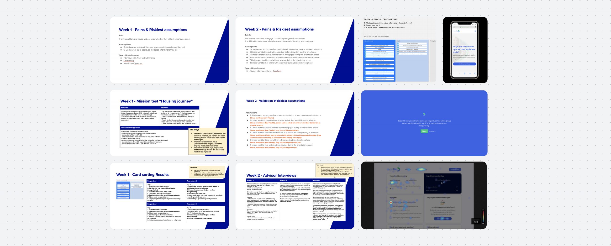
Overview of the weekly validations and various experiments we ran
Screen evolution: Getting a pre-approved mortgage offer
Challenge 1: steps leading to getting the pre-approval, is it clear?
The conclusion we drew from the pain points were that the end-users will appreciate 1) being able to get a pre-approved mortgage offer so they can be assured that they will receive the mortgage when they bid for a house, and 2) having a clear view on what they need to get the pre-approved offer. I tried this first with more of a “dashboard” view with clear indications that some information was still missing. However, our research showed that while they liked that there was a place where all information can come together, thjey still didn’t fully get how to get the pre-approved offer.
Due to that I decided to change the view to more straight forward ‘step by step’ approach, where they can simply follow along the steps required to get the pre-approved offer. Our research later showed that this view resonated with the users.
A progression on the pre-approved offer page
Challenge 2: How much does the users want to calculate?
User research showed that our persona, the tech-savvy Linda, hence our end-users wanted more autonomy and transperancy on figuring out how much mortgage they could get without the help of any bank or mortgage consultants. We thought of a possible solution as having a mortgage calculator before getting to the pre-approved offer. I tested this out by including a simple calculator as one of the steps on applying for the pre-approved offer, but the research showed that the users would want to even take a step further and have an independent mortgage calculator where they can have all the freedom to calculate their financial situations, and get the offer based on what they configured in the calculator.
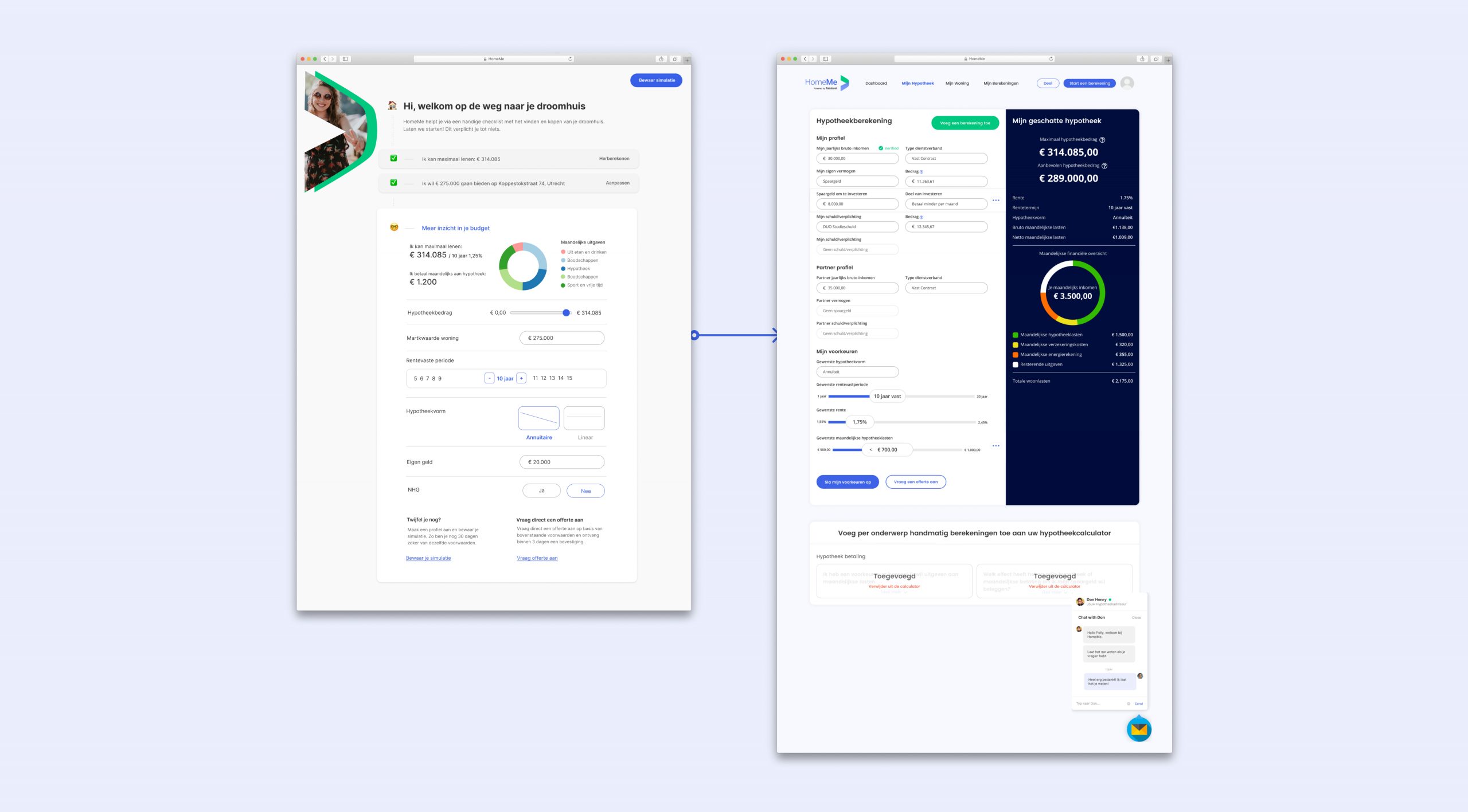
A calculator progression from left to right. We have eventually verified that the end-users appreciated having a fully configurable mortgage calculator.
Challenge 3: Having a clear snapshot of all my information
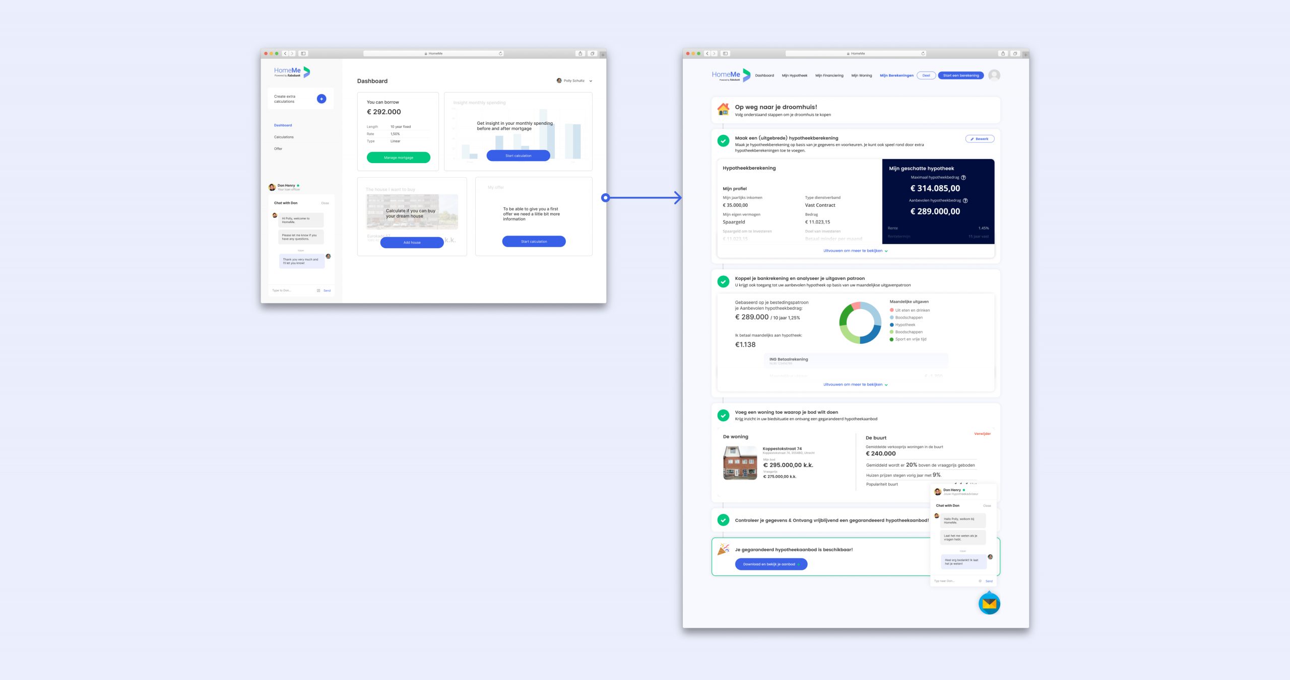
We have heard the users’ wants through our research, and dug a little deeper into having a dashboard where users can start building up their mortgage profile, save, and come back to it at any time. I took the basic dashboard we’ve created before, and took it a step further where the end-users could have a bird’s eye view on their calculator with the latest calculation saved, a step by step guide to their pre-approved offer, previous offers, expense report, and eventually even being able to add a house they would want. Our research later showed that they really like having the dashboard to give them all information they would like on their home buying journey.
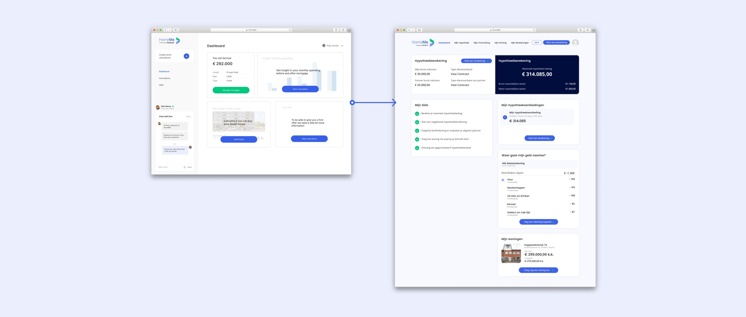
The dashboard progression from a very basic information to a dashboard that’s more of a home buying journey companion.
Conclusion & Impact
We successfully completed the Solution Fit phase together, with the list of MVP features that were validated, to head straight to next phase, the development of HomeMe. My involvement with the project ended at this point, but we made sure to communicate to the next team what they needed to know to continue, for instance, a set of assumptions that needed to be validated continously, such as ‘Lindas will request a pre-approved offer’.
There are more work laid out for the team for sure, but I’m excited to have been part of journey and to think we could help people buy their first home with confidence.
Robin Sieun Bae © 2024